All about Colors- Pantone and Color Extraction
- Ananya Banka
- Mar 18, 2022
- 3 min read

Updated: Mar 30, 2022
Yellow!
Today's post is all about colors. Lets talk, pantones and how to extract the right colors.
We have an endless amount of colors to choose from and a limited vocabulary to describe them. I know it is super annoying when you want some particular shades or tints of blues or reds and you don't have any way to describe them properly.
Well, thank goodness for pantone!
Pantone is like the universal language of colors. It helps to understand the exact color one is searching for. Pantone has made life easier for designers. Identifying, matching and communicating colors have become so much easier with pantone. It is nothing but numbers given to every shade and tint of every color which is universal. So if you want a certain color but don't know the name of it, just look it up, find the correct pantone number and you are good to go. Every year a pantone color for the year is decided. For this year the color is Very Peri.
To find out pantone number, we will use color.adobe.com. It is very easy to use and very helpful too. Here's how to use it-
First open Adobe Color. On the create page, you will find the extract theme option.
Now all you have to do is open any image and the colors will be extracted by itself.
I chose one of the pictures from my mood board. Find my post on mood boards here- https://ananyabanka.wixsite.com/fashioncognition/post/mood-board-and-its-importance-in-the-design-process
You can extract five colors at a time. Every color will have the pantone number written on it. If you want to use that color, just copy the number.

You can also extract multiple themes from an image, make color swatches and further decide on color combinations too. You can move the little circles around to change the colors.
For this one, I picked out random colors from my mood board. I picked one main color from each picture for my swatches.

I tried going for much muted tones for this color palette. It has shades of maroon to beige.

This palette has all the warm tones and I added blue for one cool color. Blue has the emphasis on this palette.

These swatches are more on the pastel side. They have similar tones as the last one but these look more like tints of them.

This is one of my personal favorites. I am all about the nude tones. From brown to beige to white, these colors look just beautiful together. I tried extracting these tones from the mood board.

I took all of these color swatches to photoshop and added them in the library. From there I finalized a color board of 9 colors.

This color board has colors that are pastels and also some earthy tones, both of which I absolutely love.
Lets try extracting colors from some famous paintings and designer items.
We all know Vincent van Gogh and his beautiful paintings. Lets try extracting colors from one of his masterpieces called The Red Vineyard.

This color palette has colors which are warm. I picked out different shades of red and yellow.
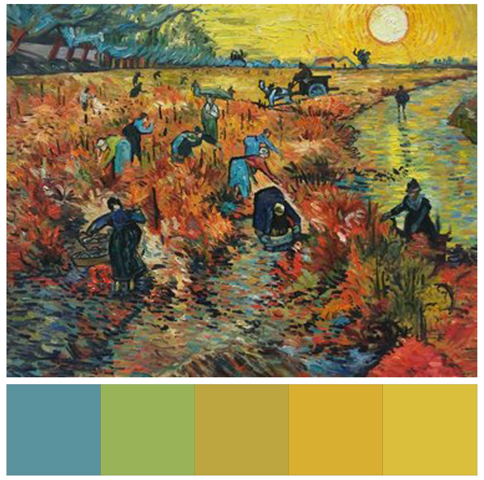
I picked both cool and warm colors here. The green brings in a feeling of freshness.
Next up we have Marc Jacobs Spring/Summer 2019 collection. Lets make color swatches from it.

The orange in this monochromatic palette brings out the principle of emphasis.

This color palette has mostly toned down shades of the previous palette.
The next one is a Salvatore Ferragamo bag. It has beautiful and a lot of colors to choose from.


This color palette has very muted and earther tones. These are some of my personal favorites.
Learning about pantone and color extraction was very important. Pantone numbers really help in getting the right shade and tint of any color. It is also easy to communicate the exact shade that we are looking for. It also helps in making the color board and mood board. Adobe color was a great site to learn about. I can add any image to it and extract the right colors.
Thank you for reading this post! You can always subscribe for more such content :)
References
Studio, T. (2022) The Red Vineyard Van Gogh reproduction | Van Gogh Studio, Vangoghstudio.com. Available at: https://www.vangoghstudio.com/the-red-vineyard/ (Accessed: 29 March 2022).
Model Watch: Talea Lischetzki from Big Island, Hawai‘i (2019). Available at: https://www.honolulumagazine.com/model-watch-talea-lischetzki-from-big-island-hawaii/ (Accessed: 29 March 2022).
Photo by Arno Senoner on Unsplash (2020). Available at: https://unsplash.com/photos/ooj5VfXq5o8 (Accessed: 29 March 2022).


Absolutely brilliant n stunning 👏👏👏
Absolutely brilliant 👏